The Art of Crafting Memorable Asian Food Packaging Designs
Want to make your Asian food packaging stand out? Focus on creating attractive packaging that feels fresh and authentic. Use colors and images that boost the appeal of your packaging. Think about your brand identity and how each detail reflects your story. Choose materials that protect your food packaging and make it easy for people to use. Great asian food packaging does more than look good—it builds trust and keeps people coming back.
Key Takeaways
- Pick colors, pictures, and fonts that fit your brand and culture. This helps your packaging stand out and connect with people. Keep your logo simple. Tell your brand story in a clear way. This builds trust and helps people remember your product. Use packaging materials that keep your food safe. Think about using eco-friendly choices to help the earth and get more shoppers. Make packaging that is easy to open, safe, and handy for busy people. This makes their experience better. Try different shapes and textures to get noticed on shelves. This makes your packaging fun and easy to remember.
Visual Elements
When you design food packaging, you want people to notice it fast. The best way to do this is by using strong visual elements. Color, imagery, and typography can help your packaging stand out. These things also help you connect with your audience.
Color Choices
Color is very important in packaging design. You can use color to send a message or show your brand’s style. In Asian food packaging, colors often have special meanings. Here are some common color palettes and what they mean:
- Red means good luck, happiness, and celebration in Chinese culture. You see red a lot during holidays like Chinese New Year. Red also makes people feel excited and hungry, which is great for food packaging.
- Gold stands for wealth, luxury, and success. Many brands use gold with red to make their packaging look fancy and festive.
- Yellow catches the eye and makes people feel happy. It also helps people feel hungry, so you see it on many snack packages.
- Green and earthy colors show health, freshness, and care for the environment. These colors are good if you want your product to look natural or organic.
- White can mean purity in some places, but in many Asian cultures, it means mourning. Most brands do not use white for food packaging in these places.
Tip: Use only a few colors. Japanese and Chinese packaging often uses just a couple of colors for a simple look. This makes your design easy to see and remember.
Color does more than just look nice. It changes how people feel about your product. Warm colors like red and orange make food look tastier. Cool colors like green and blue can make your product seem healthy, but sometimes less tasty. Pick colors that fit your product and the feelings you want to create.
Imagery & Motifs
Imagery and motifs make your packaging special. Traditional Asian motifs can make your packaging feel real and important. For example, Chinese folk art, dragons, paper-cutting, and calligraphy show cultural history. In Japan, you might see simple patterns or clean lines that show tradition.
When you use these symbols, people feel closer to your product. They see something they know and feel trust. Motifs like zodiac animals, painted pottery, or embroidery can tell a story about your food’s origin. This makes your packaging more than just a wrapper. It becomes a piece of culture.
Studies show that using cultural symbols and stories helps people feel connected to your brand. They trust your product and want to share it with others. You can use these motifs in new ways, mixing old and new styles to keep your packaging interesting.
Note: Always respect the culture behind the motifs you use. Work with local artists or groups to make sure your design feels real and does not use stereotypes.
Typography
Typography is the style of the words on your packaging. It may seem small, but it can change the whole look. In Asian food packaging, you often see bold, easy-to-read fonts. Sometimes, brands use calligraphy or brush-style writing for a traditional feel.
You want your product name and key information to stand out. Use big, clear fonts for the main words. If you use a traditional script, make sure it is still easy to read. Mixing modern and classic styles can help your packaging look both real and new.
A good idea is to keep your font choices simple. Too many fonts can make your packaging look messy. Use one or two styles that fit your brand and story.
Remember: The right typography helps people find what they need quickly. It also makes your packaging look better.
By focusing on color, imagery, and typography, you can make packaging that looks good and feels special. These visual elements help your food packaging stand out and connect with your customers.
Brand Identity
Logo & Name
Your logo and name are the first things people notice on your food packaging. A strong food packaging design uses color and shapes in the logo to send a message. For example, sharp edges can show strength, while soft shapes feel friendly or mysterious. The colors you pick for your logo can make people feel trust or excitement. Some brands use mascots or icons, like Jollibee’s smiling bee, to create a fun and welcoming look. When you print your logo on custom food packaging, try embossing or using bright colors to make it pop. You can even add QR codes for loyalty programs or easy reordering. These small touches help your brand stand out and make your packaging more memorable.
Tip: Keep your logo simple and easy to recognize. This helps people remember your brand, even from far away.
Brand Story
People love a good story, especially when it comes to food packaging. Sharing your brand’s story on the package helps shoppers feel connected to your product. You can talk about your history, your values, or even how to use your product. When you tell a story, you show what makes your brand special. This builds trust and makes people want to try your food. Many Asian food packaging brands use pictures and step-by-step guides to show how to prepare the food. This makes your packaging feel helpful and friendly. When your story matches your brand’s mission, people feel like they are part of something bigger.
- Use graphic storytelling with images and short text.
- Show cooking steps with simple icons.
- Share real customer stories for a personal touch.
Note: Packaging that shares your story can boost sales and make people feel loyal to your brand.
Consistency
Consistency is key in food packaging design. When you use the same logo, colors, and style across all your products, people start to trust your brand. Custom food packaging with a matching look helps shoppers spot your products quickly. High-quality materials and clear information also show that you care about your customers. If you want to grow your brand, keep your packaging design the same for every product. This builds long-term trust and makes your brand easy to remember.
- Use the same color palette and logo placement on every package.
- Choose shapes and materials that fit your brand’s style.
- Make sure your brand voice sounds the same on all packaging.
A consistent look across your packaging helps you build strong brand equity in the Asian food packaging market. People will recognize your products and feel confident choosing them again and again.
Packaging Design & Materials
Material Choices
Picking the right material for food packaging is important. You want your food to stay fresh and safe. The material you use also changes how people see your product. Some materials work better for some foods. Other materials help your packaging get noticed.
Here’s a quick look at the most common materials you’ll find in food packaging:
|
Material |
Properties |
Common Applications |
Advantages |
Disadvantages |
|---|---|---|---|---|
|
Plastics |
Versatile, durable, good barrier properties |
Bottles, films, trays, containers for various foods |
Cost-effective, durable, versatile |
Environmental concerns with disposal and recycling |
|
Paper & Cardboard |
Renewable, recyclable, printable |
Boxes, cartons, bags, labels for dry foods |
Sustainable, printable, low cost |
Limited moisture and oxygen barrier unless coated |
|
Metals |
Strong, durable, excellent barrier |
Cans, foil for beverages, soups, processed foods |
Excellent protection, long shelf life, recyclable |
Potential corrosion in some cases |
|
Glass |
Inert, impermeable, transparent, recyclable |
Bottles, jars for beverages, sauces, jams |
Excellent barrier, inert, recyclable |
Heavy, breakable, costly to transport |
|
Bioplastics |
Made from renewable resources, biodegradable |
Films, bags, containers (developing applications) |
Renewable, biodegradable in some cases |
Fragile, variable performance and cost |
Each material has good and bad points. Glass keeps food fresh and keeps in flavor. But glass is heavy and can break. Plastics are light and cheap. But plastics can hurt the environment if not recycled. Paper and cardboard are easy to print on and work well for boxes. But they do not always keep food fresh unless coated.
When you pick a material, think about food safety and shelf life. Some packaging, like active packaging, helps keep food safe by blocking germs and air. In China, there are strict rules for food packaging. These rules make sure materials are safe and labeled right. You should pick materials that protect your food and follow the rules.
Tip: Always match your material to your food. Wet foods need strong barriers, while dry snacks can use lighter, printable boxes.
Eco-Friendly Options
Sustainability is very important in food packaging today. Many shoppers want eco-friendly packaging that helps the planet. You can show you care by picking materials that are good for the earth and easy to recycle or compost.
Here are some of the best eco-friendly choices for Asian food packaging:
- Compostable packaging made from cornstarch, bamboo fiber, or bagasse (sugarcane waste) breaks down quickly and helps reduce waste.
- Plant-based bioplastics, like PLA from corn or sugarcane, offer a renewable option for films and containers.
- Recyclable materials such as aluminum, paperboard, and glass are popular for their environmental benefits.
- These materials support the 3Rs: Reduce, Reuse, Recycle.
- Minimalist packaging designs that use less material help cut down on waste.
- Clear labels and logos make it easier for people to know how to recycle or compost your packaging.
Many people want sustainable packaging but get confused by the labels. Some people think paper is always best. Others like glass because it can be recycled. You can help by using simple words and pictures to show how to throw away your packaging. When you make recycling or composting easy, people feel good about buying your product.
Note: Eco-friendly packaging boosts your brand’s image, but you need to educate your customers. Use clear instructions and symbols to guide them.
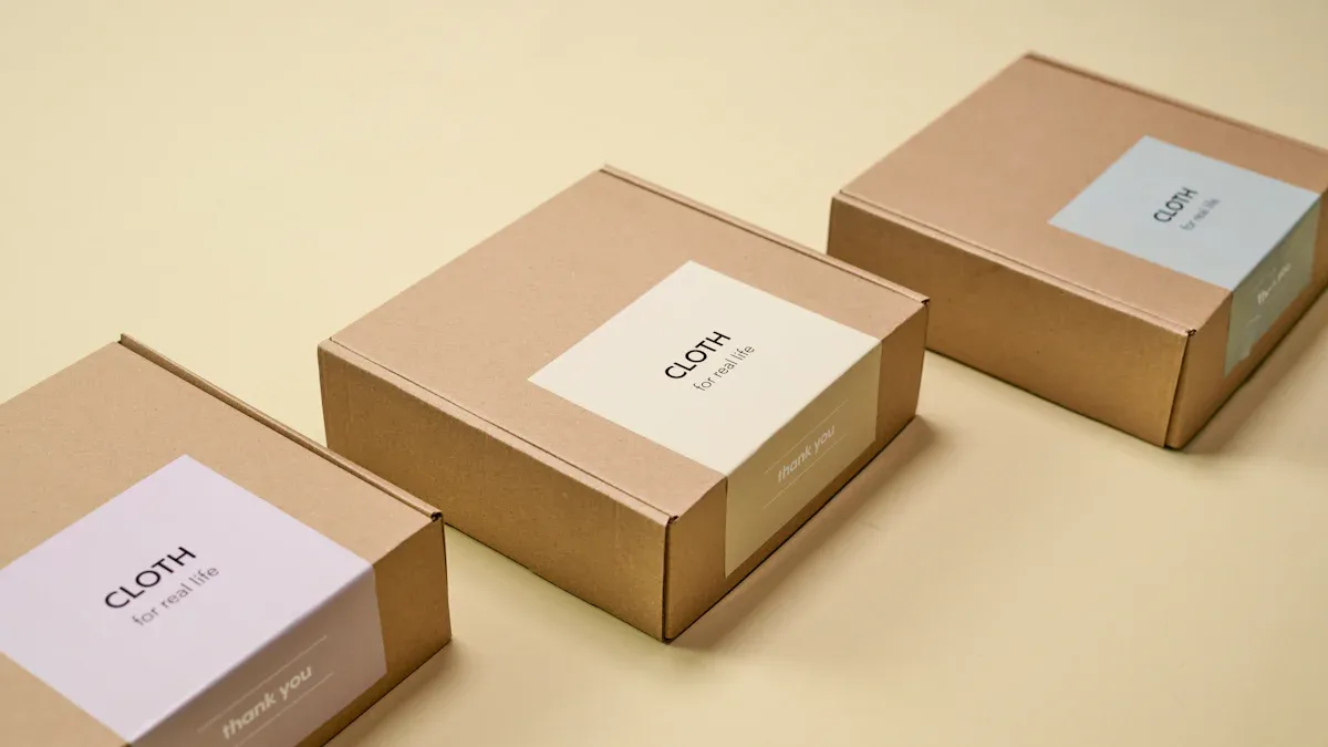
Size & Structure
The size and shape of your packaging can make your product special. You want your food boxes to fit your food, keep it safe, and look nice on the shelf. If your packaging is too big, you waste space and material. If it is too small, your food could get crushed or spill.
Unique shapes help your product stand out. Some brands use boxes shaped like pentagons, hexagons, or pyramids. In Japan, juice boxes sometimes look and feel like real fruit. These fun designs make people want to try your product.
You can also add fun features. Some snack boxes have characters that move or connect when you put two packages together. This makes your packaging fun and easy to remember.
Here are some ways to make your packaging design pop:
- Try unusual shapes for your food boxes, like triangles or hexagons.
- Use textures or patterns that match your food, such as fruit skins or traditional motifs.
- Add windows or cutouts so people can see the food inside.
- Make sure your packaging is easy to open and close.
Callout: Creative packaging designs not only attract attention but also create a better experience for your customers. When people enjoy opening your food boxes, they remember your brand.
When you use the right materials, eco-friendly options, and smart shapes, your packaging does more than just cover food. It keeps food safe, helps the planet, and makes your brand stand out in the busy world of Asian food packaging.
Clarity & Simplicity
Clear Labeling
You want your food packaging to speak for itself. Clear labeling helps shoppers trust your product and pick it with confidence. In Asia, countries like China, Japan, and India have strict rules for food labels. You must show the product name, ingredients, where it was made, and when it expires. Some places, like Japan, even ask for special details on infant foods and ban misleading words like “fresh” or “pure.” These rules keep people safe and make sure your packaging is honest.
When you use clear labels, you help shoppers find what they need fast. Many people in China like labels with green colors and Chinese characters. They trust labels that are easy to read and cover about a quarter of the package. If your label is clear and follows the rules, people will trust your brand more.
Tip: Add more than one language to your label. Multilingual support helps you reach more shoppers and makes your product feel welcoming.
Readable Fonts
Fonts matter more than you think. If people can’t read your label, they might skip your product. Choose fonts that are bold and simple. Fonts like Seoul give a real Korean feel, while Pluvix Luxury Font looks stylish and easy to read. Make sure your font works well in every language you use. A good font helps your food packaging design look clean and professional.
- Use large letters for important words.
- Avoid fancy scripts that are hard to read.
- Test your font on different backgrounds and sizes.
Minimalism
Less can be more. Minimalist packaging uses simple shapes, few colors, and clear words. This style makes your product look pure and high-quality. Studies show that shoppers think simple packaging means fewer ingredients and better quality. They are even willing to pay more for it. Minimalism also helps your brand stand out, especially when people want a “fresh start,” like at the beginning of the week.
If you want clear packaging designs, focus on what matters most. Show only the key facts and honest images. This makes your packaging easy to spot and remember.
Eye-Catching Packaging Design
Shelf Impact
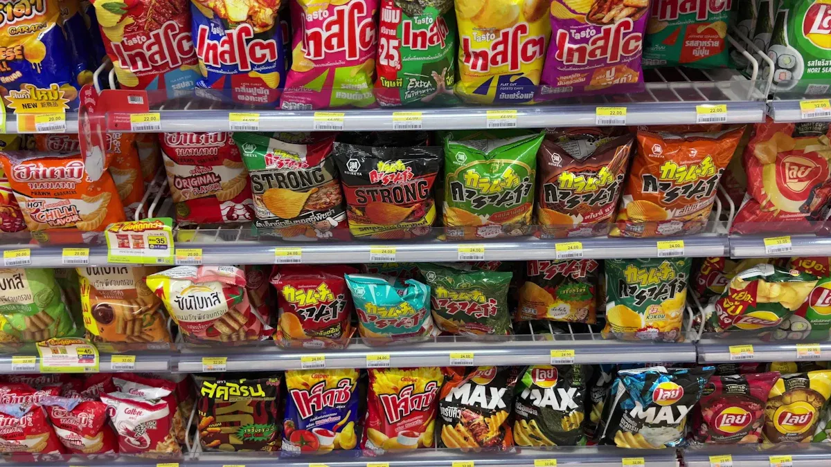
When you walk down the snack aisle, you see hundreds of food boxes. How do you make yours stand out? You need packaging design that grabs attention right away. Use bold colors like red or green to spark emotions and make people hungry or curious. Try graphics and fonts that feel fresh and fun, especially if you want to reach younger shoppers.
You can also use textures on your packaging. A bumpy or soft surface makes people want to touch and pick up your product. Some brands use playful textures that remind you of the food inside, like the chewy “QQ” feel in Asian treats. When you add these sensory details, you turn your packaging into an experience, not just a wrapper.
Tip: Tell a story with your packaging design. Show where your food comes from or highlight a special flavor. This builds trust and helps shoppers connect with your brand.
Unique Shapes
You don’t have to stick with boring rectangles. Unique shapes make your food boxes pop on the shelf. Try pentagons, pyramids, or even shapes that look like the food inside. These creative packaging design ideas help your product stand out and make it easy to remember.
A cool shape also saves space and makes stacking easier. Some brands use off-center images or windows so you can peek at the food. When you combine shape, color, and texture, you create eye-catching packaging design that shoppers won’t forget.
- Try these ideas for your next packaging design:
- Use a hexagon or triangle for your food boxes.
- Add a window to show off your product.
- Play with textures that match your food.
Limited Editions
Want to boost excitement? Launch a limited-edition packaging design. People love to collect special food boxes, especially during holidays like Chinese New Year. When you use symbols like zodiac animals or festive colors, you tap into traditions and make your product feel exclusive.
Limited editions create urgency. Shoppers want to buy before it’s gone. This strategy often leads to more sales and lots of social media buzz. You can even team up with artists or influencers for a fresh look. Many brands see big sales jumps—sometimes up to 30%—when they use limited-edition packaging during special seasons.
Note: Always respect cultural symbols in your packaging design. This builds emotional connections and keeps your brand strong.
Consumer Experience
Convenience
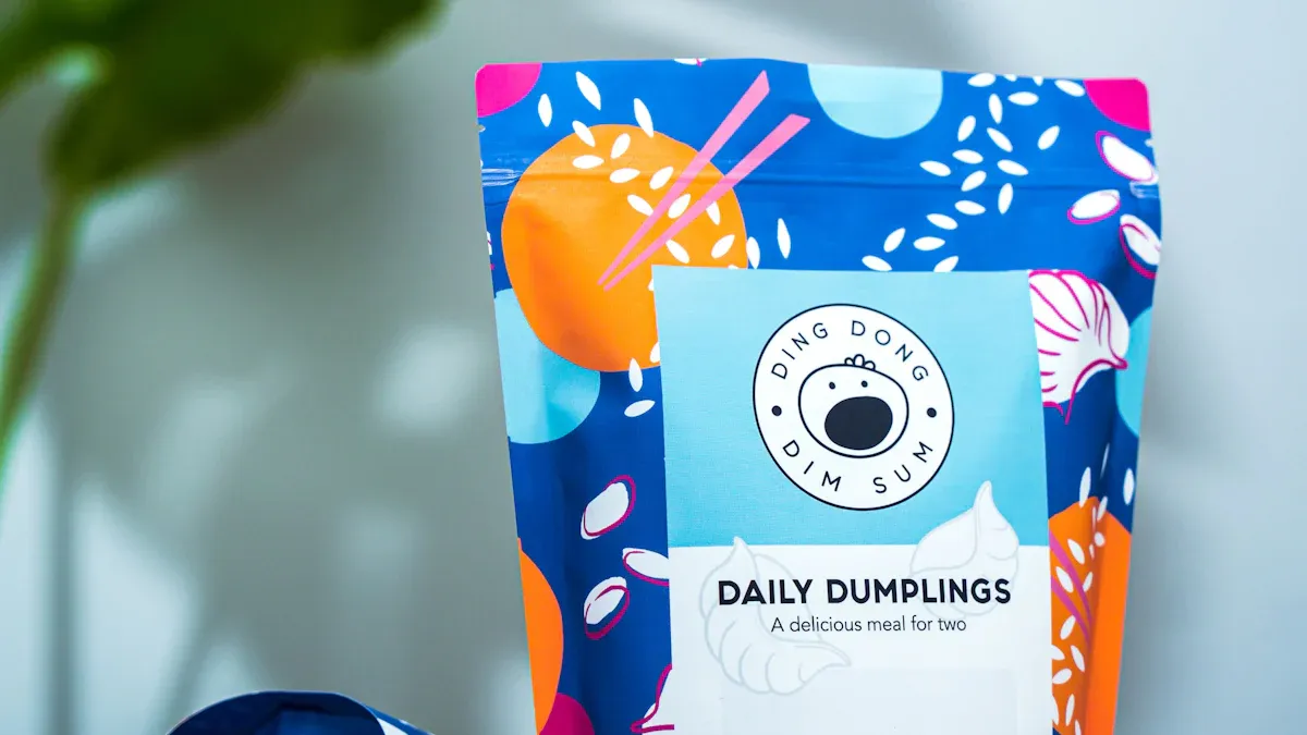
You want food packaging that fits your busy life. In Asia, more people live in cities and have less time to cook. That’s why brands focus on making packaging easy to use. You see more stand-up pouches, spouted pouches, and easy-peel lids. These features help you open your food quickly and eat on the go. Many packages now come in single-serve sizes or have resealable tops, so you can save some for later. Ready-to-eat meal kits and resealable drink bottles are favorites for younger shoppers.
- Easy-to-open lids save you time.
- Lightweight packages make it simple to carry snacks in your bag.
- Resealable packs keep your food fresh.
- Some packages even heat or cool your food by themselves!
Japanese food packaging often turns unboxing into a fun moment. You might find clever tabs, pull strings, or pop-up boxes. These small touches make eating more enjoyable and memorable.
Tip: Choose packaging that is easy to store and open. It makes your day smoother and keeps your food tasting great.
Safety Features
You care about food safety, and so do brands. Asian food packaging uses strong seals to keep food fresh and safe from germs. Tamper-evident bands and breakaway closures show if someone has opened the package before you. Some packages use special printing or liners to stop counterfeiting.
Packaging materials block out air, moisture, and light. This keeps your food’s flavor and nutrients safe. For products like baby formula, you often see resealable lids and extra safety seals. Companies test their packaging to make sure it stays strong during shipping and storage.
Safety first! Always check for seals and tamper-proof bands before you open your food.
Emotional Connection
Great packaging does more than protect food. It makes you feel something. When you open a box with a cute design or a special message, you remember it. Some brands use traditional patterns or fun mascots to make you smile. Others add QR codes so you can share your experience online or learn more about the food’s story.
- Share your favorite packaging on social media.
- Look for limited-edition designs during holidays.
- Enjoy the surprise of a clever unboxing.
When packaging feels personal, you want to show it off. That’s how brands build loyalty and turn customers into fans.
Making Asian food packaging that people remember takes some work. You need to think about how it looks, what it means, and if it is easy to use. You can use bright colors, old patterns, and cool shapes to help your brand stand out. Want some fast tips? Try these:
- Pick colors and designs that fit your story
- Use labels that are simple and easy to read
- Choose materials that are good for the earth
- Make sure the package is easy to open and use
Great packaging helps people remember your brand. It also makes them want to buy your food again!
FAQ
What colors work best for Asian food packaging?
Bright reds, golds, and greens catch the eye and feel traditional. These colors often mean luck, wealth, or freshness. You can use them to make your packaging stand out and feel authentic.
How can I make my packaging eco-friendly?
Choose materials like recycled paper, bamboo, or bioplastics. Use less plastic when possible. Add clear recycling instructions. Customers notice when you care about the planet.
Why does packaging shape matter?
Unique shapes grab attention on crowded shelves. A fun box or pouch makes people curious. You can also use shapes that match your food, like a rice ball-shaped box for onigiri.
Should I add more than one language to my packaging?
Yes! Adding another language helps more people understand your product. It also shows respect for different cultures. Many shoppers trust brands that use their own language.
How do I tell my brand story on the package?
Share a short story or use pictures. Show where your food comes from or what makes it special. People love to learn about your brand while they shop.


